~ 5 ~

Responsive Web Design
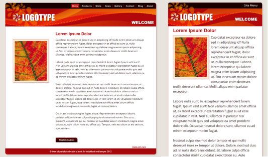
A main new feature of this release is support for Responsive Web Design (RWD). With the increasing use of mobile devices for internet access (some surveys suggest that more users access websites via mobile than any other type of device) there has been increasing demand for website design tailored to mobile screen form factors. Although modern mobile devices such as phones have excellent web browsers able to view any website, a mobile-optimized website should not require zooming to view the text. So typically this means the main content would be a single column, in a larger point size, to be readable at a glance on a phone. Mobile websites often have reduced content, and are navigable with single finger operation to scroll and navigate (one hand - thumb scrolling and single taps). While you could create two separate websites, one designed for narrow screen mobile, another for traditional wider desktop screens, replicating the content across two separate websites would be tedious and time consuming, especially if you had to do this every time you updated the text or images. So RWD is a relatively new technique that means your website responds dynamically to the screen size. Instead of having two separate websites, that is two separate HTML pages, you instead have one HTML file that can vary its layout (respond) depending on screen size (and resolution) of the device being used to view the website. The same web page shown at different widths. The first is how it looks on a wide screen display, the second is
for narrow screens such as mobile devices. The text column is narrower, a larger point size is used, better
suited to mobile screens, the header re-positioned and NavBar replaced by a single button drop-down menu.
Multiple Variants
Traditionally creating RWD sites has involved a lot of pretty complex JavaScript programming. But since Xara Designer Pro X10 is a ‘zero programming’ designer focussed tool, we’ve developed a way to create
Xara Designer Pro X10 release notes


