~ 10 ~

Xara Designer Pro X10 release notes


Orientation of mobile devices
When you re-orientate a mobile device, such as a phone or tablet, that changes the width of the browser, and can instantly switch to another variant - this is exactly the intent and benefit of RWD. So it’s possible, using the right width values, to design different versions of your website specifically for upright (portrait) or sideways (landscape) orientation, and different versions again for upright or sideways tablets. But we do not recommend you go overboard by having too many variants - see the ‘costs of creating RWD websites’ below.Common device widths
To help you target popular mobile devices here are the browser widths of some popular devices Device upright sideways iPhone up to version 4s 320 480 iPhone 5 320 568 Galaxy S3, S4, S5 360 640 Galaxy Note (1,II, 3) 360 640 Nexus 5 360 640 HTC One 360 640 Tablets: iPad (all models) 768 1024 Nexus 7 600 960 Nexus 10 800 1280 Kindle Fire HD 534 802 Note the actual resolution of the screen is typically much higher than the values shown above - the


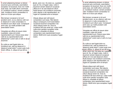
A two-column arrangement (in this case text flowing
from one text box to another). For mobile use one
column might be a better arrangement. Don’t copy /
paste text, instead move the columns to be one
above the other, as shown on the right example.