~ 13 ~

Xara Designer Pro X10 release notes

Example Responsive & Supersites
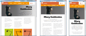
Restaurant Menu. This is an example Supersite and Responsive Website designed for tablets and above. It uses Supersite transitions (a different one for each page), but also responds to browser width or tablet orientation, showing landscape for landscape orientation and portrait version for portrait orientation (this does not have a mobile version). It also has ‘fit to screen’ on so it scales to fit any browser size. You can use arrow key as a navigation shortcut or a swipe gesture on touch devices. http://xaragroup.magix.net/menu2/ Here’s a version of the same document demonstrating the ‘vertical scrolling’ Supersite option. http://xaragroup.magix.net/menu3/ Print Style Documents: The document you are reading is typical of a print or ‘desktop publishing’ style document, consisting of fixed pages. Here it’s published in various ways; Pro X10 Release Notes - A Vertical scrolling Supersite - A Page transition Supersite - Conventional website Web Presentation: This is an example Web Presentation, based on the Wave presentation template. This has page transition and ‘fit to screen’ set. http://xaragroup.magix.net/presentation1/ Islands photo slide-show: This is an example of a simple responsive photo slide-show website, using fit-to-screen, swipe gestures, automatic Retina resolution imagery, and device orientation. This contains large very high resolution photos, so is best viewed on a fast internet connection. http://xaragroup.magix.net/islands1 One of the RWD templates: This is one of the free themes included with Xara Designer Pro X10, that includes variants for three classes of device, normal ‘desktop’ wide web-browsers, medium sized browsers such as tablets, and narrow mobile screens. http://xaragroup.magix.net/vue2/ You can view the variants on a desktop browser by reducing the browser width. The mobile variant has a larger text size that is better suited to a very small screen, and uses a single tap pop-up navigation button in place of a classic NavBar. Combination Responsive Supersite: This is a modern website design (and is pretty large and complex) using a combination of responsive layouts (narrow the browser to see other variants) and various photo slideshow, supersite scrolling animations, and mouse-over effects. http://xaragroup.magix.net/xara-supersite/ Click to enlarge. All the vector graphics, photo edits, text and layout were done entirely using Designer Pro.


