~ 7 ~

responsive websites, in a purely visual way. You still have all the power of freeform layout, ‘anything
anywhere’ web design, that Xara Web Designer is famous for. But now you can create multiple variants
of the same website. You can create one variant designed for narrow screen mobile devices, perhaps
another layout for intermediate small screen tablets, and another variant for traditional wide screen
desktop.
The important thing is that the content, that is the text, the pictures, the graphics and color schemes,
are shared between all the variants. The second important point is that the multiple layout variants for
each page are not separate HTML files, but all part of one HTML file, that can dynamically and instantly
change from one layout to another depending on the browser width.
For each variant you produce you can customize the layout as much as you want. You can resize and
reposition elements on the page (the text, the photos) and these remain shared between the variants.
Edit the text for the narrow mobile variant and the text is updated for the other variants. Or you can
decide that you want different content or graphics on one variant. It’s not uncommon that mobile
variants have reduced content - all this is possible with Xara Web Designer RWD.
Technical Note: This is true Responsive Web Design, because all the variants of each page are
the same single HTML file, using CSS media queries and JavaScript to dynamically adjust the page
layout depending on the device width. But this is not ‘fluid’ RWD. See here for more.
Responsive ‘Retina’ or HiDPI Resolution Control
The second area where mobile and tablet devices differ from most desktop web browsers is that they
support far higher resolution graphics. Xara Web Designer supports this completely automatically, and
will produce both normal resolution and Hi-DPI or Retina resolution images for all graphics and photos.
The website then intelligently uses the correct version of the image depending on the resolution of the
browsing device.
 Website variants Website
variants... This displays a dialog that allows you to add a new variant.
Click the Create button and choose a design width in pixels. Here you can see I have two variants one called
Main that is designed to be 960px wide, and one called Mobile that is 480px wide.
Website variants Website
variants... This displays a dialog that allows you to add a new variant.
Click the Create button and choose a design width in pixels. Here you can see I have two variants one called
Main that is designed to be 960px wide, and one called Mobile that is 480px wide.
How to create a variant
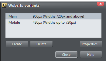
Xara Web Designer shows each variant in a separate tab, so you can quickly and easily see and switch between the variants. To create a variant of an existing web page, select the menu Utilities Website variants Website
variants... This displays a dialog that allows you to add a new variant.
Click the Create button and choose a design width in pixels. Here you can see I have two variants one called
Main that is designed to be 960px wide, and one called Mobile that is 480px wide.
Xara Web Designer 10 release notes