Website Creation
• Supersites: o How to create a Supersite o Page transitions o Transition direction o Scale to fit screen o Swipe gestures & hotkeys o Preview window o Supersite Web Analytics • Responsive Web Design o Multiple variants o Retina or HiDPI screens o How to create a variant o What’s shared across variants o How to add an object to all variants o NavBars, Repeating Objects & Menus o Multi-column behaviour o Screen orientation o Common screen widths o How to change the text size in one variant o The costs of creating RWD websites • Example Websites • Slideshow Presentations • Password Protected WebsitesPhoto Editing
• Shadow & Highlight controls • Selective Enhance-by-color • Auto-rotation of digital camera images • Panorama stitching improvements • Photoshop plug-ins in 64-bit Pro X10 • PhotoTools 2 plug-inOther
• SmartShapes • FontAwesome graphic shapes • Word and RTF file import • Editing PDF files • Content Catalog • New Insert Menu
~ 1 ~

Xara Designer Pro X10 release notes


You can use the keyboard Page-
Up and Page-Down keys to
navigate this Supersite.
More Information:
Gary Priester’s First Look articles on Xara Xone:
First Look at Web Designer 10 Premium
and also:
First Look at Photo & Graphic Designer 10
The Designer Pro X10 home page
Xara Designer Pro X10 release notes
Pro X10 contains all the new features and improvements of the recent Web Designer 10 and Photo & Graphic Designer 10 releases. The following are the major new features of this release;
~ 2 ~
Supersites
Modern web browsers support many advanced HTML5 and CSS3 effects allowing much more dynamic and visually exciting websites to be created. Xara Supersites are an alternative way of publishing ‘print-style’ documents and websites. Instead of just being a separate set of web pages, with the typical ‘click-wait-load’ way to navigate your website, a Xara Supersite provides instant navigation between pages, along with slick animated page transitions - all designed to make your website stand-out from the crowd. Or you can choose to have the whole website, all pages, presented as a single scrolling list of pages, one below the other, or arranged horizontally, one beside the other. Or you can choose to have your website ‘fit to screen’ so that it smoothly and automatically resizes to fit any browser window along with swipe actions (on touch devices) to navigate from page to page. Xara Supersites are compatible with all modern web browsers and mobile devices. Supersites are not appropriate for all websites (the very large or complex ones), but for smaller websites, or any place where you want to present your content in a more interactive, more slick way. Anywhere you might consider providing a PDF document, or a download of a PowerPoint presentation, or want a slick interactive slide show of content - Xara Supersites are a great new way to do this. Your content can be presented directly on the web, requiring no downloads, no plug-ins or special apps to view.
Xara Designer Pro X10 release notes


~ 3 ~
How to create a Supersite
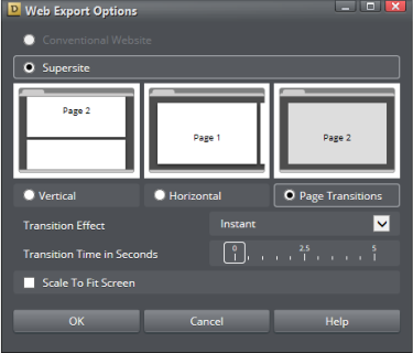
Any website can be turned into a Supersite by selecting the menu Utilities Web Export Options
which brings up this dialog:
The top options select whether this is a conventional (paged) website or a Supersite. If you select
Supersite, then the next option provides three basic page arrangements; all pages arranged vertically,
so this is much like a multi-page PDF document in Adobe Reader, or arranged horizontally so you scroll
sideways to see pages, or finally the last option to provide animated page transitions.
If you select the Page Transition option, then the next two controls become enabled providing a drop-
down list of page transitions and a slider control of the transition time (speed).
How to make each page transition different
The above Page Transitions option sets the default transition for all pages in your site. But you can set different transition effects on individual pages. To do this use the Page & Layer Gallery, right click on the page, and select the Web page properties option. The bottom section of the dialog allows you to set the individual transition property for this page.Transition direction
The transition effect you choose for an individual page sets the transition going to the page in question. Each transition has two versions or directions of animation. When you go to a page from an earlier page the animations play in one direction. If you go to the page from a later page then it plays in the reverse direction. In other words going forward through your website will play the animation as described, going back will play it in reverse. For example if you select ‘slide in from the right’ it will do this when going from one page to the next, but if you go back, it does the opposite and slides out to the right.Scale to fit screen
The ‘Scale to fit screen’ option creates pages that are smoothly scaled to fit any browser window size. If you resize your browser window it will re-size the page content to always fit.
Xara Designer Pro X10 release notes

~ 4 ~
Note: It only makes sense if relatively small website pages are set to ‘fit to screen’. If you make a very
tall page fit to screen, then everything is reduced so much it’s not readable.
Be sure to preview the whole website, not just the current page.
Preview your Supersite
To see what your Supersite looks like just preview the website using the normal Preview control on the top bar:
Be sure to preview the whole website, not just the current page.
Swipe gestures and Hot Keys
If you have the ‘fit to screen’ option checked, then on mobile devices you can use swipe gestures to navigate to the next or previous page in your website. For Supersites that use page transitions you can use page Up / Page Down keys to navigate back and forth on the website.Browser performance - animation smoothness
Supersite animations are hardware accelerated, which is supported by almost all modern browsers, including those on phones and tablets, to ensure a fast and smooth animation. The exception is the built-in browser preview window, which for some unfathomable reason is not the same as normal Internet Explorer. But if you open the preview in the full browser, by clicking any of the browser icons at the top of the preview window, you should get full performance animations.
Web Analytics, Supersites and RWD
Supersites are one HTML file for the entire website, so there is a single Head and Body section for the whole website. if you place scripts on each of the pages (using the Web Properties dialog) these are concatenated into the one section for the whole website. Similarly with RWD sites (see next section), all the variants of each any page are exported as one HTML page, so there can only be one analytics code snippet for each page as usual. You can’t, in other words, track which variant they visit, only whether they visit the page. Technical note: A Supersite consists of one HTML file for the whole site so keywords, description and and title meta tags are taken from the first page of the site. Search Engines still work exactly as normal with Supersites, and will index all your content, but they might jump to the home page of the Supersite when following a search engine link.
Xara Designer Pro X10 release notes

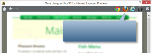
When you preview your website, click
one of these buttons to preview the full
performance website.
~ 5 ~
Responsive Web Design
A main new feature of this release is support for Responsive Web Design (RWD). With the increasing use of mobile devices for internet access (some surveys suggest that more users access websites via mobile than any other type of device) there has been increasing demand for website design tailored to mobile screen form factors. Although modern mobile devices such as phones have excellent web browsers able to view any website, a mobile-optimized website should not require zooming to view the text. So typically this means the main content would be a single column, in a larger point size, to be readable at a glance on a phone. Mobile websites often have reduced content, and are navigable with single finger operation to scroll and navigate (one hand - thumb scrolling and single taps). While you could create two separate websites, one designed for narrow screen mobile, another for traditional wider desktop screens, replicating the content across two separate websites would be tedious and time consuming, especially if you had to do this every time you updated the text or images. So RWD is a relatively new technique that means your website responds dynamically to the screen size. Instead of having two separate websites, that is two separate HTML pages, you instead have one HTML file that can vary its layout (respond) depending on screen size (and resolution) of the device being used to view the website.
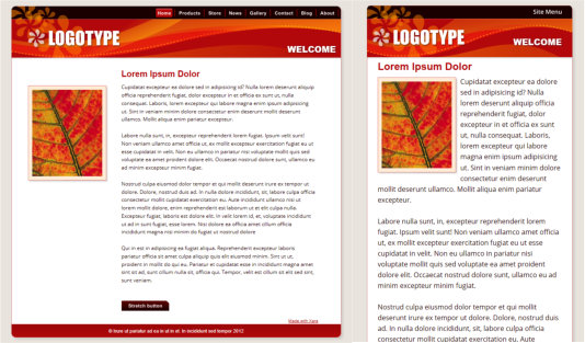
The same web page shown at different widths. The first is how it looks on a wide screen display, the second is
for narrow screens such as mobile devices. The text column is narrower, a larger point size is used, better
suited to mobile screens, the header re-positioned and NavBar replaced by a single button drop-down menu.
Multiple Variants
Traditionally creating RWD sites has involved a lot of pretty complex JavaScript programming. But since Xara Designer Pro X10 is a ‘zero programming’ designer focussed tool, we’ve developed a way to create
Xara Designer Pro X10 release notes
~ 6 ~
responsive websites, in a purely visual way. You still have all the power of freeform layout, ‘anything
anywhere’ web design, that Xara Designer Pro is famous for. But now you can create multiple variants of
the same website. You can create one variant designed for narrow screen mobile devices, perhaps
another layout for intermediate small screen tablets, and another variant for traditional wide screen
desktop.
The important thing is that the content, that is the text, the pictures, the graphics and color schemes,
are shared between all the variants. The second important point is that the multiple layout variants for
each page are not separate HTML files, but all part of one HTML file, that can dynamically and instantly
change from one layout to another depending on the browser width.
For each variant you produce you can customize the layout as much as you want. You can resize and
reposition elements on the page (the text, the photos) and these remain shared between the variants.
Edit the text for the narrow mobile variant and the text is updated for the other variants. Or you can
decide that you want different content or graphics on one variant. It’s not uncommon that mobile
variants have reduced content - all this is possible with Xara Designer Pro RWD.
Technical Note: This is true Responsive Web Design, because all the variants of each page are
the same single HTML file, using CSS media queries and JavaScript to dynamically adjust the page
layout depending on the device width. But this is not ‘fluid’ RWD. See here for more.
Responsive ‘Retina’ or HiDPI Resolution Control
The second area where mobile and tablet devices differ from most desktop web browsers is that they
support far higher resolution graphics. Xara Designer Pro X10 supports this completely automatically,
and will produce both normal resolution and Hi-DPI or Retina resolution images for all graphics and
photos. The website then intelligently uses the correct version of the image depending on the
resolution of the browsing device.
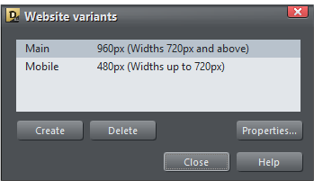
Website variants Website
variants... This displays a dialog that allows you to add a new variant.
Click the Create button and choose a design width in pixels. Here you can see I have two variants one called
Main that is designed to be 960px wide, and one called Mobile that is 480px wide.
How to create a variant
To create a variant of an existing web page, select the menu Utilities Website variants Website
variants... This displays a dialog that allows you to add a new variant.
Click the Create button and choose a design width in pixels. Here you can see I have two variants one called
Main that is designed to be 960px wide, and one called Mobile that is 480px wide.
Xara Designer Pro X10 release notes


~ 7 ~
Xara Designer Pro X10 shows each variant in a separate tab, so you can quickly and easily see and
switch between the variants. Because the variants are intimately related, and they are really part of
the same document, all the variant tabs colored blue.
You can switch between the variants just by selecting the appropriate document tab.
If you close one tab of a multi-variant RWD document, it will close the whole document (after a suitable
prompt if you have not saved any changes.)
If you want to delete one of the variants use the Website variants dialog described above.
When you create a new variant, all the content of the main website appears, mostly unchanged, but on
a narrow page width. It’s now up to you to re-arrange the layout as you wish for this new variant. You
can move items around the page freely, reduce the width of text columns, resize and re-position
images, and you have to do this for all the pages of your variant website.
Note: When you first create a variant, the page size is changed, the page background is adjusted,
but nothing else is moved. Since the design and layout of the variant is entirely up to the
designer, it’s not possible to automatically create a variant layout. Some of bundled themes,
available from the Designs Gallery or the new Content Catalog, have multiple variants already
designed. Those templates that have variants have ‘(R)’ appended to their name.
Note: The ‘breakpoint’ between two variants is half way between the widths of the two. So in the
above case for browser widths less than 720 it will show the narrow one and widths above that it
will show the wider one. Also note because most mobile devices always try to fit the browser
content into the screen, it doesn’t matter that your page is wider than their screen pixels - it will
be scaled down to fit by the browser.
Share with all
variants.
You can switch between the variants just by selecting the appropriate document tab.
If you close one tab of a multi-variant RWD document, it will close the whole document (after a suitable
prompt if you have not saved any changes.)
If you want to delete one of the variants use the Website variants dialog described above.
When you create a new variant, all the content of the main website appears, mostly unchanged, but on
a narrow page width. It’s now up to you to re-arrange the layout as you wish for this new variant. You
can move items around the page freely, reduce the width of text columns, resize and re-position
images, and you have to do this for all the pages of your variant website.
Note: When you first create a variant, the page size is changed, the page background is adjusted,
but nothing else is moved. Since the design and layout of the variant is entirely up to the
designer, it’s not possible to automatically create a variant layout. Some of bundled themes,
available from the Designs Gallery or the new Content Catalog, have multiple variants already
designed. Those templates that have variants have ‘(R)’ appended to their name.
Note: The ‘breakpoint’ between two variants is half way between the widths of the two. So in the
above case for browser widths less than 720 it will show the narrow one and widths above that it
will show the wider one. Also note because most mobile devices always try to fit the browser
content into the screen, it doesn’t matter that your page is wider than their screen pixels - it will
be scaled down to fit by the browser.
What’s shared across variants, and what’s not?
When you create a new variant, the content is shared across all variants, but the size and position of items on the page is local to each variant. If you edit the text it will be changed in both variants. If you change the size of objects, that will apply to one variant only (because it’s likely you will want objects to be different positions and sizes on the different variants). If you drag ‘n’ drop a photo onto an existing photo, it will be replaced in all variants. On the other hand if you edited the shape of the photo or cropped it, or changed the fill (image size, rotation or position inside the picture frame) then these are local to each variant. This is useful because it means you can not only change the size and position of photos on the variants, but change their aspect ratio and image crop. Once you’ve created a variant then new items are local to that variant, but you can easily arrange that they are shared (called LiveShared) by right clicking and selecting Website variants Share with all
variants.
Xara Designer Pro X10 release notes


~ 8 ~
How to add a new object to appear on all variants
If you create a new object, say a text column, a graphic or photo, this is initially not shared across the variants. But if you want to share it use the Utilities Website variants menu or just right click on it,
and select Variants Share with all variants.
If you do not want an item on the page to be shared across all variants just un-select this same option.
Technical note: If you have different variants of photos, say a different size, crop or fill position,
then Xara has to create multiple versions of the photo for the published website. However this
doesn’t have a significant performance overhead (it doesn’t slow down your website), as the web
browser loads the correct version initially, and then, in the background, downloads the other
variant images. So this means the initial version you’re looking at (be it mobile or desktop) will
always download as fast as it can, but if you change your browser width or orientation, it will
instantly switch to the other version.
How to have different text in each variant
Typically you want to share the same content in all your variants, just presented in an optimized fashion for the different widths. So normally text is shared, and that includes not just the words, but the style, color, font size etc. See below to find out how to vary the text size in each variant. If you want to have different content in any variant, that is not shared, then you can either just create a new text item on one variant - by default this is not shared. Or you can stop sharing an item, including text, by right clicking and selecting Website variants Stop sharing with variants. You can’t have
parts of the same text item not shared, say just a few words. Either the whole text item is shared (so
when you update one, it updates other variants), or the whole text item is not shared (in which case
edits appear only in that variant).
LiveShare - how to tell which objects are shared
When you select an object, those that are shared across the other variants have double parallel lines shown in the top right of the selection. This photo has a double line marker, top right, which indicates it’s ‘live shared’ on one or more variants. You can resize, crop and adjust the fill as required,and that will stay local to each variant. but if you swap the picture, say by dragging a new one on top, then all variants will change.NavBars. Repeating Objects
It’s likely that you will want a different NavBar design or layout on any narrow variants. NavBars on each variant are independent, so you can customize them as required. You might want a horizontal one for wide websites and a vertical one for narrow devices.
Xara Designer Pro X10 release notes


~ 9 ~
Xara Designer Pro X10 release notes
When Repeating Objects are shared across variants they are not ‘live shared’ (which means they are
independent of the other variants). This is necessary for most repeating objects, such as headers and
footers, because you’ll want different ones on the variants.
But this means when you select Variants Share across variants on a NavBar, you’ll be prompted that
this will be turned into a simple copy. You will then need to edit the NavBar as you please on the new
variant (say change its design, or orientation), and then ‘Repeat on all pages’ again to copy across all the
pages of that variant. Remember if you select the ‘Site navigation bar’ option in the NavBar dialog (just
double click the NavBar) then you can create a NavBar that automatically contains links to all your
pages.
Share across variants on a NavBar, you’ll be prompted that
this will be turned into a simple copy. You will then need to edit the NavBar as you please on the new
variant (say change its design, or orientation), and then ‘Repeat on all pages’ again to copy across all the
pages of that variant. Remember if you select the ‘Site navigation bar’ option in the NavBar dialog (just
double click the NavBar) then you can create a NavBar that automatically contains links to all your
pages.
Mobile websites are better with menus, not NavBars
Because of the narrow width of mobile screens, it’s common to replace a NavBar or row of buttons with just a single navigation button that shows a pop-up menu. Designer Pro supports dynamic pop-up (or pop-down) menus, and if your website has an automatic ‘site navigation bar’ (where the buttons automatically reflect the pages), then there’s a hidden short-cut way to convert a NavBar design into a single button menu. Double click the NavBar to bring up the NavBar editor. Delete each button in the main list, so there’s only one remaining button (typically called Home). Make sure this has no link on it. Now un-check and then re-check the ‘Site Navigation Bar’ option. This will re-build a Menu on the single button, with an entry to each page of your website. You can of course edit the name of the button and the menu entries as required. (The key here is that when you make a button that has no link into a ‘site navigation bar’, it will put a menu on it. If the button had a link, then it would replicate that button into a NavBar.) This method only applies to websites that have the automatic ‘Site Navigation Bar’ option chosen. If you have a customized NavBar, then you will need to build a menu manually, using this dialog. To customize the appearance of the menu, click the ‘Pop-up menu style’ button, bottom right. Remember to preview your working menu it’s necessary to preview the web page.Variants have the same pages
When you add or delete a page in one variant, it automatically creates or removes the page in the other variant. So your website always has the same page arrangement in all variants.Multi-column behaviour
Most websites use columns of text, no text boxes or frames. Each text column or frame is treated as a separate shared item. So this means if you have text in two separate areas (either two separate or text boxes) then you can’t copy the text from one into the other, as that edit will just be shared back to the other variants. So in order to re-arrange your two columns into one column, just move them to be one above the other. If you have ‘Push’ attribute set (Right click Position on page...) then editing one will push the text down as you need.

~ 10 ~
Xara Designer Pro X10 release notes
Orientation of mobile devices
When you re-orientate a mobile device, such as a phone or tablet, that changes the width of the browser, and can instantly switch to another variant - this is exactly the intent and benefit of RWD. So it’s possible, using the right width values, to design different versions of your website specifically for upright (portrait) or sideways (landscape) orientation, and different versions again for upright or sideways tablets. But we do not recommend you go overboard by having too many variants - see the ‘costs of creating RWD websites’ below.Common device widths
To help you target popular mobile devices here are the browser widths of some popular devices Device upright sideways iPhone up to version 4s 320 480 iPhone 5 320 568 Galaxy S3, S4, S5 360 640 Galaxy Note (1,II, 3) 360 640 Nexus 5 360 640 HTC One 360 640 Tablets: iPad (all models) 768 1024 Nexus 7 600 960 Nexus 10 800 1280 Kindle Fire HD 534 802 Note the actual resolution of the screen is typically much higher than the values shown above - the
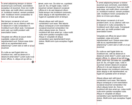
A two-column arrangement (in this case text flowing
from one text box to another). For mobile use one
column might be a better arrangement. Don’t copy /
paste text, instead move the columns to be one
above the other, as shown on the right example.
~ 11 ~
Xara Designer Pro X10 release notes
values shown here are ‘CSS pixels’ which are not the same things as screen pixels.
Also, perhaps confusingly, most mobile browsers will scale down pages that are larger than the sizes
shown above to fit into their screen. So even if you have a 960 wide website, most mobile devices will
show the whole width of this website, in either orientation. This is the normal and intended behaviour
of mobile browsers. So it doesn’t matter if you make a website slightly larger than the max browser
width of a tablet. But it’s not recommended that you create any website wider than 1280 pixels, and
typically 1000 pixels, as research has shown that’s the preferred, ideal width range for most websites.
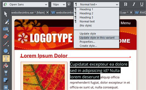
Here I’ve adjusted some ‘Normal’ style to be larger 16px font. Select ‘Update style in this variant’ from the
Style menu to do what it says.
How to change the text size of a variant
It’s often important that you use different sized text for small screen variants of your website because the screen is typically only two or three inches wide when held upright, the common way. So it’s possible to have the same content, but in a different Text Style for each variant. Just change the size of some text that’s in a Style, say a section of the ‘Normal’ style that is used on your body text. You can now update the Style definition of ‘Normal’, but just for this variant. Do this by selecting the ‘Update style in this variant’ option from the Text Tool Style drop-down.
Here I’ve adjusted some ‘Normal’ style to be larger 16px font. Select ‘Update style in this variant’ from the
Style menu to do what it says.
Older browsers
Older browsers such as IE8 and earlier do not support RWD, so these will only show the main variant of your website. You are recommended to have the latest versions of Internet Explorer, Firefox, Chrome or Safari browsers, all of which support modern HTML standards. At the time of writing IE11 is currently the fastest browser, with the highest quality text rendering. Android browsers: Many Android devices ship as standard with an outdated ‘stock’ web browser (typically a blue world icon). Whilst Xara created RWD sites do work in the majority of these browsers, we highly recommend you install the Chrome browser app which is available free for almost all Android devices, and is much faster, more reliable and more compatible with modern standards. Google Chrome ships as standard on the latest Android 4.4 (KitKat).
~ 12 ~
Xara Designer Pro X10 release notes
The cost of creating RWD websites
Creating multiple variants of a website can be a complex process. Do not underestimate the time and care required to create and then maintain RWD websites. This is as true of Xara Designer Pro X10 as it is for RWD created by any other method. Typically a web design firm or design contractor will charge two to three times as much for a RWD site as for a single conventional site, and that’s because it can easily take tow or three times as long to develop and maintain. The process of taking an existing website and converting it to a RWD site will be time consuming and can be a complex process. You are in effect creating multiple websites, and just about every part of your page layout will have to be re-arranged for two or more variants. The more variants you tailor your content for, the longer it will take to create and maintain. New RWD templates in the Designs Gallery
Templates marked with an (R) contain responsive
variants, typically a narrow mobile variant. Some have
three variants aimed at ‘normal’, tablet and phone
devices.
If you do not want a variant, it’s easy to delete it. Just
select the Website Variants dialog and Delete the
variant you no longer want.
~ 13 ~
Xara Designer Pro X10 release notes
Example Responsive & Supersites
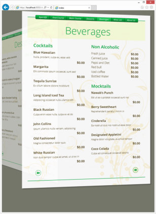
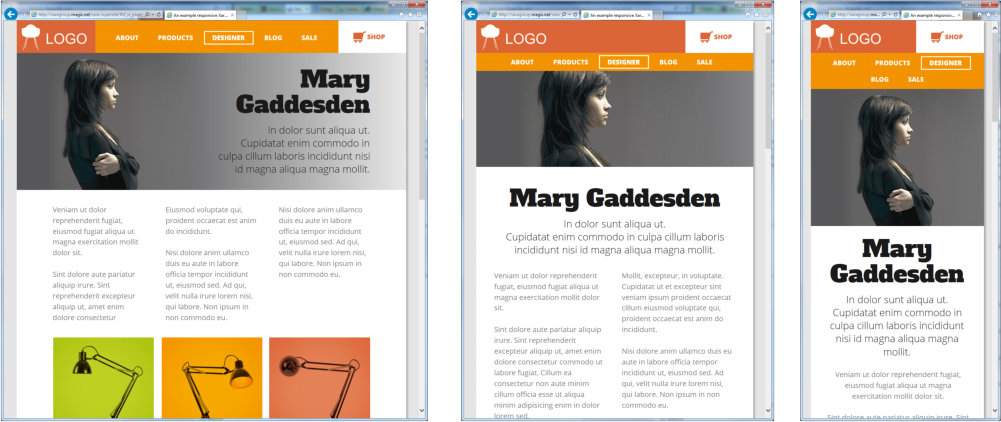
Restaurant Menu. This is an example Supersite and Responsive Website designed for tablets and above. It uses Supersite transitions (a different one for each page), but also responds to browser width or tablet orientation, showing landscape for landscape orientation and portrait version for portrait orientation (this does not have a mobile version). It also has ‘fit to screen’ on so it scales to fit any browser size. You can use arrow key as a navigation shortcut or a swipe gesture on touch devices. http://xaragroup.magix.net/menu2/ Here’s a version of the same document demonstrating the ‘vertical scrolling’ Supersite option. http://xaragroup.magix.net/menu3/ Print Style Documents: The document you are reading is typical of a print or ‘desktop publishing’ style document, consisting of fixed pages. Here it’s published in various ways; Pro X10 Release Notes - A Vertical scrolling Supersite - A Page transition Supersite - Conventional website Web Presentation: This is an example Web Presentation, based on the Wave presentation template. This has page transition and ‘fit to screen’ set. http://xaragroup.magix.net/presentation1/ Islands photo slide-show: This is an example of a simple responsive photo slide-show website, using fit-to-screen, swipe gestures, automatic Retina resolution imagery, and device orientation. This contains large very high resolution photos, so is best viewed on a fast internet connection. http://xaragroup.magix.net/islands1 One of the RWD templates: This is one of the free themes included with Xara Designer Pro X10, that includes variants for three classes of device, normal ‘desktop’ wide web-browsers, medium sized browsers such as tablets, and narrow mobile screens. http://xaragroup.magix.net/vue2/ You can view the variants on a desktop browser by reducing the browser width. The mobile variant has a larger text size that is better suited to a very small screen, and uses a single tap pop-up navigation button in place of a classic NavBar. Combination Responsive Supersite: This is a modern website design (and is pretty large and complex) using a combination of responsive layouts (narrow the browser to see other variants) and various photo slideshow, supersite scrolling animations, and mouse-over effects. http://xaragroup.magix.net/xara-supersite/
Click to enlarge. All the vector graphics, photo edits, text and layout were done entirely using Designer Pro.
~ 14 ~
Xara Designer Pro X10 release notes
Slideshow Presentations
Designer Pro X10 can produce a special type of Supersite called a Web Presentation. These are very like Microsoft PowerPoint slideshow presentations, except they are websites that anyone can view - no special software plug-ins or players needed to view. Version 10 has simplified the process of creating such Presentations: • Simpler ways of creating and viewing the steps on each slide • Presentations automatically scale to fit to any browser window size • Two aspect ratio ‘empty’ templates, 16x10 wide-screen and 4:3 traditional (old) screen aspect ratio. (16x10 is a better compromise for some wide-screen monitors and tablets that are not exactly 16:9, and it’s not so squashed. But you can create any aspect ratio you require of course.) • New smooth ‘Supersite’ page transitions
This is the Presentation control bar that appears when you create a new Presentation document.
(Incidentally, these call-outs are SmartShapes - see below)
Each slide of the Presentation is a new page, and you can have any number of layers (Presentation
steps) that animate onto each slide. Although presentation steps use layers, you do not have to use
the Page & Layer Gallery to create or edit your presentation. The above Presentation controls appear
top right when you create a Presentation document (File > New > Presentation)
Presentation websites are Supersites, so they provide fast and slick page animation, ‘fit-to-screen’ and
can be driven using the keyboard arrows keys, page up and down keys, and swipe actions on touch
devices.
Here’s an example Presentation (using one of a range of presentation templates included free), that
demonstrates some of the possible page transitions:
http://xaragroup.magix.net/presentation1/
Use the arrow keys to step through the steps on each slide. Try adjusting the size of your browser
window, or rapidly flicking through the pages using the Page Up /Down keys.
Note: A small change in the behaviour of Presentations is that when returning to a page (slide)
you’ve previously been to, it returns to the exact state it was left - i.e. with the same step position.
Older versions always returned to the first step of each slide.
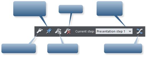
Create new step
Pin selection to
background
Duplicate step
Delete step
Drop-down
list of steps
Animation options
~ 15 ~
Xara Designer Pro X10 release notes
Other website creation changes
Push / Pull behaviour
Most web templates have automatic page resizing and object ‘pushing’ as you move items around the page or edit text to enlarge or reduce text columns, text panels etc. You can control this using the right- click context menu ‘Position on Page’. Items with Push on will push other items with Push on, and increase the page size. We’ve changed the behaviour slightly so that if you move at item up the screen that is touching another Push object it will now pull any touching objects up the screen as well. And if the last item is touching the bottom of the page, it will pull the page bottom edge up as well. Deleting an item with Push on, does not move things around - in this case you need to manually re- arrange items on the page and if necessary reduce the page size (simply drag the bottom edge of the page up).Password protected websites
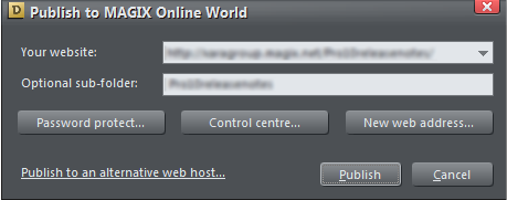
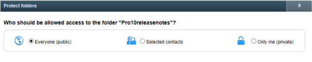
If you publish your website via MAGIX Online World (free space provided) you can now easily password protect that website. Includes full facilities to manage your authorization list.
Click the password protect button on the Publish Dialog to control this feature.
This open a web-based control panel of your MAGIX Online World account, with a simple and direct way
of controlling who can access your website.
You can create as many contacts as you require, along with a specific password for each contact. You
can create named groups of contacts for easier management of group access to your website, online
presentation or supersite document.
~ 16 ~
Xara Designer Pro X10 release notes
Xara RWD design philosophy
Or ‘Why doesn’t Designer Pro support fluid RWD?’ In a nutshell Xara Designer Pro is a WYSIWYG design tool. For the designer this means what you see and design on the Xara page is exactly what your website viewers will see, down to the pixel and the exact line wrap points. And this applies just as much to RWD pages as to normal non-responsive websites. Xara Designer is the only web design tool that provides this unique benefit - you can design page layouts with precise object and text positions, with complete design freedom (anything anywhere), text repelling around irregular shapes and photos, and myriad other design features, and yet be sure of the exact text position, wrapping points and everything else on the page on all browsers. You can be sure that your design is exactly what your viewers see. One of the consequences of this approach is that fluid text (text that re-flows as you change the browser width) is not supported, and is not compatible with this WYSIWYG design philosophy. With dynamic, fluid text you cannot be sure where things will be on the page - because it varies continuously. Line wraps, and thus column lengths even vary between different browsers. For designers this lack of certainty and variability is a nightmare of testing. You can’t flow text around irregular shapes. You can’t, for example, have an arrow pointing at a particular word on the page, because with traditional web design, you can’t be sure of where words and paragraphs wrap, or be sure of lengths of text on the page. So fluid text means you could not get the precise ‘guaranteed right’ WYSIWYG layout accuracy that is the benefit and main intent of the Xara Designer Pro software. This is the reason that around 90% of professionally designed websites are not fluid. Designers want design certainty, and this is what Xara Designer Pro provides. In this respect Xara Designer Pro is much more like a traditional ‘desktop publishing’ design tool (where obviously 100% exact WYSIWYG is required) than it is a traditional HTML web design tool - and yet Designer Pro produces efficient, standards compliant, cross browser compatible HTML5 websites, with automatic Retina compatible photos and graphics. And with Designer Pro X10 all this remains true for multi-variant responsive website design, while still being a totally ‘programmer-free’ solution. Finally, step back, consider why RWD was invented in the first place? It was to enable single HTML designs to respond (instantly and without reloading any HTML) to narrower screen widths of phones and later, tablets. Mobile devices do not support fluid, variable width browsers. So the ‘fluid’ RWD provides no benefits to the very devices RWD was designed for! In summary ‘fluid web design’ goes against the ‘exactly placed’ and ‘design certainty’ principle of Designer Pro and, secondly, mobile devices do not support fluid design anyway. (To be clear they do support dynamic switching to different widths when you re-orientate and this RWD is fully supported by Designer Pro X10).
Photo Editing Improvements
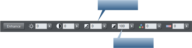
• Shadow & Highlight controls • Selective Enhance-by-color • Auto-rotation of digital camera images • Panorama stitching improvements • PhotoTools 2 plug-inNew Shadow & Highlight controls
There are two new Photo Enhance controls that appear on the Photo Tool
InfoBar.
The new Enhance Shadows control will lighten darker areas of photos without affecting the mid-tone or
lighter areas. This is more sophisticated than a simple brightness or levels adjustment in that it’s
selective about what dark areas it enhances. It typically avoids adjusting very small areas, e.g. single
dark pixels, and only adjusts larger areas of darker colors.
Below are some examples:
Click to enlarge
The original image is on the left. The center one has the had shadows enhanced with the new tool. The
Enhance Shadows
Reduce Highlights

~ 17 ~


Xara Designer Pro X10 release notes
~ 18 ~
right example has the brightness adjusted, which does make the shadows lighter, but results in the
image looking washed out as some lighter and mid-tone shades have also been lightened.
Only the shadowed area has been enhanced, the mid and bright tones of the sky have not been
altered.
The highlights have been reduced on the example on the right, revealing more details of the quilt
pattern without affecting the brightness of other parts of the image.
Note neither function can bring back data that is missing from the original photo. For example it’s
common with many lower-end digital cameras that really bright areas will clip or ‘burn out’ (e.g.
clouds) and just show as pure white. The Highlights tool cannot bring back detail missing from
such clipped whites.
Only the shadowed area has been enhanced, the mid and bright tones of the sky have not been
altered.
Highlights control
The Highlights adjustment similarly can reduce the brightness of the very brightest parts of the image.
The highlights have been reduced on the example on the right, revealing more details of the quilt
pattern without affecting the brightness of other parts of the image.
Note neither function can bring back data that is missing from the original photo. For example it’s
common with many lower-end digital cameras that really bright areas will clip or ‘burn out’ (e.g.
clouds) and just show as pure white. The Highlights tool cannot bring back detail missing from
such clipped whites.


Xara Designer Pro X10 release notes
~ 19 ~
Selective Enhance-by-color
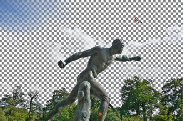
Xara Designer Pro X10 includes a new way to enhance areas of photos determined by the color. For example if you wanted to adjust only the blue sky, but no other colors in an image. This new ‘enhance-by-color’ doesn’t just let you adjust the color or saturation value, but when you select areas based on the color, you can adjust any of the P&GD Enhance options, e.g. you can adjust the brightness, contrast, adjust the hue or tint, use the new shadows control, color temperature etc. There is a new ‘color select’ icon at the end of the Enhance InfoBar:
The icon on the right end of the Photo Tool InfoBar allows you to select regions of the photo by color.
When you select this icon, you are now in ‘color-select’ mode and now further clicks on the image will
immediately select all areas of the photo of that color, or closely related colors. You will see a short
flash of a checkerboard pattern to indicate that you have selected some colors, and a new red ‘color
select’ control point will appear where you clicked.
Now if you adjust any of the Enhance controls on the InfoBar, it will apply those changes to the color-
selected areas only.
The color-select icon is highlighted, which means all clicks now select regions of the image based on the color
of the image at the click point.
Original image on the left. On the right example I have clicked on the sky where the red handle is shown.
You see a brief flash of checkerboard pattern, as shown, that indicates the region selected.
Adjusting the range of colors selected
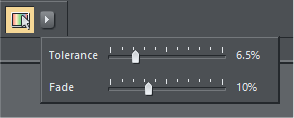
You can adjust the tolerance of the color-select process to include a wider range of shades and colors close to the selection point by using the drop down control that appears adjacent to the color-select icon when you have added any color-select control points.

Xara Designer Pro X10 release notes
~ 20 ~
When you have a selected color-select point, click the right arrow icon, to display these controls to
adjust the tolerance (range of colors) and fade (how smooth or blended the edge colors are) of the
selected color-select control points.
To review or adjust the selection
To view the selection area, just click and hold on the color-select control handle, and it will show the affected region as a checkerboard. If you drag the color-select handle, it will re-calculate and show the adjusted region as you drag.Adding additional color-select points.
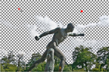
Instead of adjusting the color tolerance value, it’s sometimes better to add additional color-select points.
In this example the original clicked point was a relatively pale grayish blue, and it has selected quite a
wide range of similar blue-gray tones (which is probably what you want in this case), but you can see it
has not selected the deeper blue of the sky, top left.
To fix this simply perform another click in this area to add another color-select point. See below:
Xara Designer Pro X10 release notes
~ 21 ~
A second click has added a new color-select point and the checkerboard now
shows all shades of the sky are included.
Each new click will add a new color-select point and add the color under the point (and nearby colors)
to the selection.
When you have multiple color-select points the Tolerance and Fade controls apply to the whole
selection, not just to a given control point. Now that I have the whole sky selected, I can make other
adjustments using the normal Enhance controls.
Original image
More blue
You’re on Mars
Selecting separate areas of color
When any color-select handle is shown red, it means that selection region is active, and that additional clicks will add to that region. Adjusting any Enhance sliders will affect only this region. But suppose you want to select a different part of the image, that you want to enhance separately. In this case you can de-select the active color-select points by right clicking on a control point and choosing Deselect or pressing the Esc key once. Important: As long as the color-select mode is on, i.e. when the icon is showing selected like this
all clicks on the image will add a new color-select handle AND any adjustment of Enhance slider
values will apply only to the selected colors. This means that the normal click-drag short-cut for
the crop feature will not work.
Click the icon again to exit from color-select mode. Now drags will perform a crop, and adjusting


Xara Designer Pro X10 release notes
~ 22 ~
Enhance values will now apply to the whole image.
If the color-select handles are shown black they are not selected. Click on any handle to select it
(and any other handles that form part of this color selection). You can now adjust the position,
and any Enhance values that are applied to this color-selection.
which you can drag in or
out to resize.
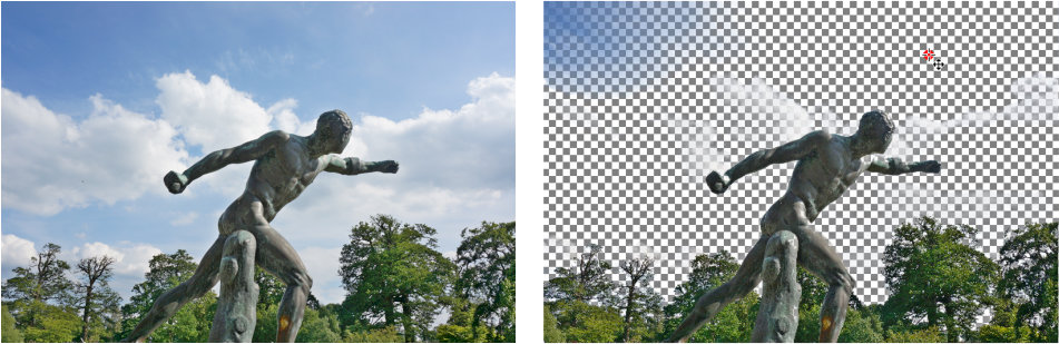
Masking & Region Selection
Sometimes you will want to select colors in only one part of an image. In this case you can use the
Mask or Region selection tools to first mask, or select, the region you want to change. The easiest way
to do this is to use the Mask Painter tool to mask, that is protect areas, or Region Painter Tool to paint
over the area you want to select colors in, before using the Color Select feature.
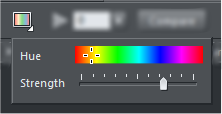
So for example let’s say I wanted to to change the color of only one of these flowers. The color select
would normally select all flowers as they are similar colors. So, first, using the Region Painter Tool
I just paint a region around the flower I want to change. It doesn’t need to be very accurate. (See below)
Removing individual color-select points
Right-click on a color-select point and select Delete this color point.Selecting, editing or completely removing color-select
Because this color-select, like most photo editing operations in P&GD, is non-destructive, it means you can change, or remove any color selection at any time. To see the color-select points the photo must be selected, you must be in the Enhance Photo Tool and you must have the ‘color-select’ switch on (right icon on InfoBar). This shows all the color-select points. Click and hold on any point to review what area this point affects - this will also highlight any other points that are part of this color-select region. To remove the color-select completely, right-click on a color-select point and choose Delete Color Selection.Resizing color-select points.
The color selected is an average of the colors under the color-select point, so it’s sometimes necessary to resize this control point, especially when trying to select a color that occupies a very small area. Each color select point has four bi-directional arrows around it like this, which you can drag in or
out to resize.
Masking & Region Selection
Sometimes you will want to select colors in only one part of an image. In this case you can use the
Mask or Region selection tools to first mask, or select, the region you want to change. The easiest way
to do this is to use the Mask Painter tool to mask, that is protect areas, or Region Painter Tool to paint
over the area you want to select colors in, before using the Color Select feature.
So for example let’s say I wanted to to change the color of only one of these flowers. The color select
would normally select all flowers as they are similar colors. So, first, using the Region Painter Tool
I just paint a region around the flower I want to change. It doesn’t need to be very accurate. (See below)


Xara Designer Pro X10 release notes
~ 23 ~
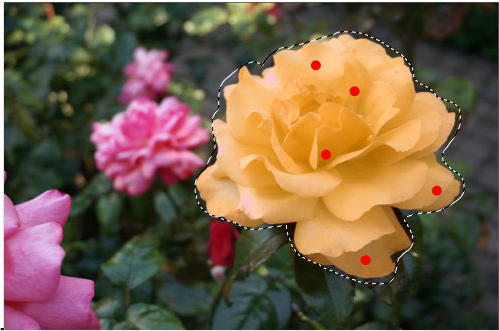
Once I have a region, then clicking to add color-select control points only selects the color inside the
region, so now I can easily re-color just the flower I want.
Here you can see I’ve had to add five color-select points to ensure I’ve selected all the various shades of
the flower. And then I just used the ‘Photo Hue’ control to adjust the color of the selection.
The region I painted around the flower ensures only the one flower is changed.

Xara Designer Pro X10 release notes
~ 24 ~
The Photo Hue control, one the Photo Tool Enhance options, has a yellow-orange color selected with
quite a high strength value to change the pink flower color into a pale orange color.
Advanced Users
As with most photo editing features in Designer Pro this is all non-destructive editing. No pixels are harmed, damaged or altered when you’re using the color-select feature. This means you can adjust any aspect of the color-selected region or enhance values at any time. Just go back into the Photo Enhance Tool, click the Color-Select icon to switch color-select on, and, if necessary, click on one of the black color-select handles. Now you can adjust the handle, add more handles, or adjust the Enhance values. If you’re editing a photo as a Photo Document (which means just the photo on its own, not a page) and you save the JPG of the edited photo - you can still change the values as long as the master image is saved alongside the JPG. See the Help under ’Editing Photo Files’. So how does color-selection work? In Color-select mode, when you click on the image Designer Pro creates an ‘enhance bitmap’ containing all the pixels of the colors you have selected. This is overlaid on top of the photo (that forms part of the photo group). If you look at the Page & Layer Gallery and expand the Photo Group, or if you select inside on the color-select area (Ctrl+click), you’ll see there is a bitmap with ‘Enhance Transparency’. Enhance transparency is a special transparency type that adjusts the pixels of the image below. For example you can draw a rectangle, give it an Enhance transparency type, and now adjust any Enhance value, say brightness. Now anything, photo, vector graphics or text, under the rectangle is brightened.Color-select Summary
• In the Photo Enhance tool,, the color-select mode control at the right end of the InfoBar
turns on color-select mode...
•
Now clicks on an image will select the color and closely related shades.
•
Subsequent adjustment of any Enhance slider will only affect the selected colors.
•
Additional clicks on the image add more colors to the selection.
•
Click-hold or click-and-drag on any color-select to preview the affected region as a checkerboard
pattern
•
Right-click on any color-select handle to delete one or all color-selection points.
•
If a photo has had color-select operations performed on it, you can see the control points by just
turning on the color-select mode switch, at the right end of the Photo Tool InfoBar
•
Un-select the color-select mode to return to normal photo operation - enhance sliders will
now affect the whole image.


Xara Designer Pro X10 release notes
~ 25 ~
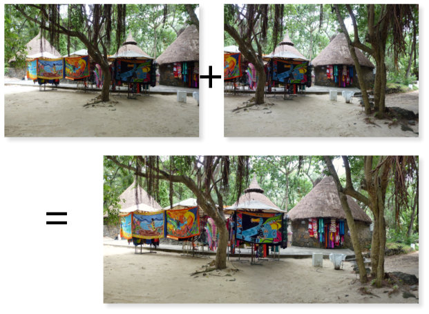
Auto-rotation of digital camera images
An increasing number of digital cameras and phone cameras (including all iPhone and iPads) no longer rotate the image in camera to ensure the JPG file appears the correct way up (e.g. when you take a picture in portrait orientation). Instead they export the JPG file in whichever orientation you take the picture, and append an orientation flag with the picture. In our view this is a considerable step backwards, because it means all software now has to detect this orientation flag and rotate the image so it appears right-side-up, whereas previously, when this rotation was done in-camera, the JPG files were always correct. Windows 8 file explorer and photo viewer do correctly re-orientate images, but Windows 7 and earlier did not. Which meant that pictures taken with iPhones, as an example, often appear the wrong orientation, often upside-down, when viewed on Windows 7. This latest V10 release includes this auto-rotation fix so such images are automatically re-orientated when opened or imported. Panorama stitching improvements The built-in panorama stitcher has also been improved.
You no longer need to arrange images left to right prior to panorama creation. It automatically detects
Xara Designer Pro X10 release notes
~ 26 ~
where and how multiple images should be stitched together. Also the resulting stitched image quality
has been improved to provide better image alignment and correction for lens distortions.
Photoshop plug-ins supported in 64-bit Pro X10
Designer Pro supports 32-bit Photoshop plug-ins, via the Live Effects ‘FX’ tool, but you were previously limited to having to use the 32-bit version of Pro in order to access these. With this release we have engineered a way to use these 32-bit plug-ins in the 64-bit versions of Pro. This also means older documents that used old plug-ins such as Alien Skin Xenofex can now be opened in 64-bit Pro and the Live Effects will render correctly. Note: Pro does not support 64-bit Photoshop plug-ins as these, unlike the original Photoshop plug-ins, are a closed, proprietary standard from Adobe.PhotoTools Plug-in
Magic Bullet PhotoLooks2 is a powerful and flexible plug-in (previously sold by Red Giant for $199) that will be bundled with all copies of Designer Pro 10. You can use the PhotoLooks tools and their detailed controls to create your own custom effects, but it also includes over 100 ready made effects inspired by commercial projects, from wedding vignettes to popular cinematic looks. This is a pretty sophisticated program in its own right, so rather than reproduce the instructions in this document, you can find the full PhotoLooks help here.
Xara Designer Pro X10 release notes

~ 27 ~
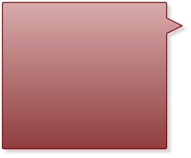
SmartShapes
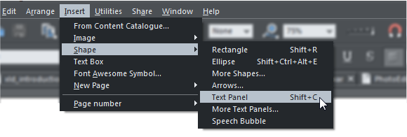
Drawing something as apparently simple as this arrow is really not that simple. Okay, it is pretty simple to draw a crude a straight arrow, using the Line tool (but even then you need to know and understand how to use the Straight Line tool and arrowhead controls). But to draw an aesthetically attractive arrow, like a graphic designer would, is difficult. In this case it has a tapering curved tail, a graduated fill color, a subtle bend to the arrow head shape. To draw this requires expertise, not just in the vector drawing tools, but in graphic design as well. And this is just a ‘simple’ arrow! Xara SmartShapes are an innovative new way to create a variety of such shapes, and more complex objects such as the speech bubble shown here. In all cases you can customize the main characteristics of the shape without using any different tools - you just drag on a few control handles to customize the shape, such as the curve of the fill arrow, or to re-position or adjust the curve of the ‘pointy part’ of the speech bubble. Another benefit is that the library of SmartShapes is internet delivered. Initially the selection is quite limited, but over time we will add to the range of shapes and objects in the catalog. So SmartShapes are an easy way anyone can add and customize a variety of vector shapes, and more complex objects such as text panels, without having to know anything about the vector shape editing tools.How to add a SmartShape
Select the main menu Insert Shape ... The most common shapes are available directly from this
menu (Rectangle, ellipse, text box etc). Additional collections of shapes, such as arrows and text panels
are available from the same menu but will open a new Content Catalog section.
How to edit a SmartShape
Either go into the QuickShape Tool, or just double click on the SmartShape, and you will see a
selection of control handles on the shape. Just drag them to adjust all the key characteristics of the
shape. Experiment by dragging the various handles to discover how the shape can be customized.
Xara Designer Pro X10 release notes


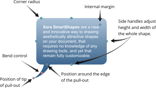
Xara SmartShapes are a new
and innovative way of drawing
aesthetically attractive shapes on
your document, which require no
knowledge of any drawing tools,
and yet they remain fully
customizable.
Xara SmartShapes can be
customized by just dragging on a
few control handles around the
shape. So for instance this is the
same speech bubble Smart-
Shape as above, just altered
slightly.
What’s more it grows as you add
more text.


~ 28 ~
Here are the control handles of the Speech Bubble SmartShape.
Xara Designer Pro X10 release notes
~ 29 ~
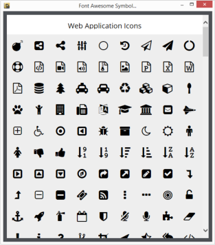
Font Awesome Graphic Shapes
There is a popular font called ‘Font Awesome’ that contains over 400 high quality symbols, icons or generally useful graphic designs. This was created as a font as a way of using such symbols in web pages. Like all fonts, the shapes are resolution-independent vectors. So we have included the font, and an easy way to view all the symbols, as a way to incorporate the symbols either as a font in text or as raw vector graphic. Select the menu Insert > Font Awesome Symbol... to view the picker. Scroll down to view all the symbols. Just tap a symbol to insert it into the current document. If you have the text caret in some text (in the Text Tool) and you insert a symbol, it will insert this as a font character, at the same size as the surrounding text. If you select the Insert option in any other tool, it will insert a vector graphic version of the symbol in the center of the page view. The benefit of being vector is that the graphic can be scaled by any degree and remain pin sharp, and you can apply any normal graphic effect such as graduated color fills, shadows etc,. So that’s a thumbs up...
Xara Designer Pro X10 release notes


~ 30 ~
Improved Word and RTF file import
Improved Word import You can now open Microsoft Word files, in both .doc and .docx format, and it provides improved, more accurate page layout. When first importing a .doc file you may be asked to download an additional component from Microsoft servers. Improved RTF import and export This release also includes enhanced RTF text format import and export. This format is used by Microsoft Word and many other text editor programs. • Import and export of anchored, embedded and floating images • Support for numbered and bullet lists including fancy ‘graphical’ bullet-list styles • Import and export of Text Styles • Strikethrough text attribute • Various other bug fixes and improvementsEditing PDF files
PDF was not designed to be an editable file format, but only as a way to distribute print-style documents. Pro has a better way of doing this via Supersites, but PDF remains an industry standard format and common way to distribute documents. This release makes significant improvements to PDF import and the editability of PDF files. PDF files commonly combine photos, vector graphics and text, all of which are supported natively in Designer Pro. PDF files containing embedded fonts now import perfectly, using the outlines of the embedded fonts, but remaining as editable text. This release includes considerably enhanced ‘text re- construction’ algorithms, making it possible to more easily edit almost all PDF files. Note, however, many PDF files contain embedded font subsets. In this case only the visible characters used in the document are included in the font. This is done to reduce the PDF file size. A consequence is that if you edit the text and use any character that is not included in that subset, it will appear in the wrong font. The only solution to this is to change the font or find and install the original font used in the PDF file.
Xara Designer Pro X10 release notes
~ 31 ~
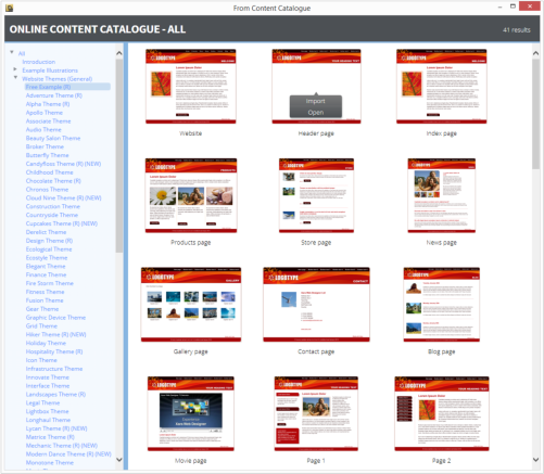
The Content Catalog
There’s a new and better way of exploring all the content - the many thousands of items of clipart, templates, shapes, page widgets, SmartShapes and more. We call it the Content Catalog. You can see it by selecting the menu Insert From Content Catalog
•
This is an online catalog, that requires you to be connected to the Internet.
•
It’s updated remotely. We can add new content, e.g. new SmartShapes, and they are instantly
available to all customers.
•
It’s a resizeble window - drag the edges or lower right corner to resize.
•
You get a small pop-up preview as you traverse the content categories on the left, of one item
from that category. Click to select and that category is expanded and shown in the right side.
•
For categories that have many items note there is a page control top right, to flick to next and
previous pages of content.
•
When using the free trial version, items shown in blue in the left content list are free to use
during the trial period. All items shown in red are available instantly for free once you’ve
purchased and unlocked the program.
After purchase, additional content that’s available for purchase is shown in red.
Xara Designer Pro X10 release notes

~ 32 ~
New Insert menu
There’s a new top level Insert menu that makes it easier (a more discoverable way) to add common items to the page.
The Insert > Shape menu has top level items of the most common shapes. The items with ellipsis ...
indicators will open the Content Catalog on a wider range of items of that category. Some of these are
SmartShapes, including this ‘Text Panel’.
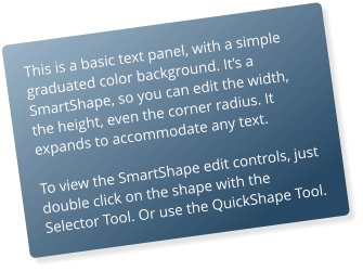
Tip: The benefit of the SmartShape text panel,
compared with previous ways of creating
automatically stretchy text panels, is that it’s easier
to adjust, you can vary the text marginsm and the
corner radius. But you can also rotate the panel
using the Selector Tool in the usual way, and it
remains editable and stretchable at any angle.
You can change the color of the panel by dropping
a color on the object, or just bring up the color
editor. To adjust the grad fill, click on it with the Fill
Tool.
This document, all graphics, photos and text layout was created entirely in Xara Designer Pro and published
online as a ‘Supersite’ document.
Xara Designer Pro X10 release notes